White Studio
Author's dentistryWhite Studio is a new generation dental clinic. The key feature of the clinic is a friendly and comfortable atmosphere for patients. Our task was to capture and visualize the key features of the clinic in its corporate identity. We wanted to avoid everything traditionally associated with medical institutions, and create something delicate, modern and calm.
The main problem with names of dental clinics consists in their sameness. Most of them evoke associations either with teeth or with a smile. We believe that a name should make our client stand out from the rest. That is why we took a different path. A dental clinic of a new format must get away from this trite image and set a new trend: health equals beauty, and it can be achieved in comfort and tranquility. Dental visit should bring joy, like a visit to a spa or a beauty salon.
We realized that we would not be able to do without associations with dentistry. However, if you add a bit of the unusual to the ordinary you will create something unique. We chose the word “white” as a characteristic of healthy and beautiful teeth, and the word “studio” as a place where medicine joins creativity and aesthetics. In addition to dental treatment, works of dental art are created at White Studio.
The client immediately approved the new name and patented it. The name turned out to be unique to the sphere of dental services.
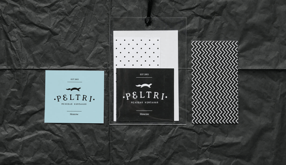
In the logo of White Studio, we decided not to use the typical teeth image and took a broader look at the subject instead — this is how a smile-shaped feather was created. On the one hand, the smile is light and weightless, on the other hand, it is calm and peaceful. This is a smile of a person who is not scared, who is confident both in their teeth and in the clinic.
The theme of lightness, which became the main theme in White Studio’s identity, continues in the textual part of the logo — a unique typeface, developed and used exclusively for this project.
The navigation system in the clinic is very important for getting visitors in the right mood. It carries the tonality, set by the logo — calmness, lightness and tranquility. The same mood was captured in the brand book. Soft pastel colors, friendly geometric patterns used in POS materials and on the website — all these elements serve one aim, which is to present White Studio as a place where dental treatment is not an unpleasant procedure but a part of a personal care programme.