Rzhev Memorial
Rzhev Memorial to the Soviet SoldierThe Rzhev Memorial is a complex built in memory of one of the bloodiest battles in world history. The key element, the monument, is located in the very place where the battles with the Nazi Army Group Center took place, and is a 25-meter figure of a soldier standing on a high embankment hill. The architect of the memorial turned to the StayFirst agency for help in developing the identity and navigation system.
The task was to support the main idea that was incorporated into the concept of the memorial. Then a big competition was held, in which the concept with cranes rising into the sky from the ground and forming the figure of a soldier, a warrior who remained lying in those places, won. And our agency needed to unobtrusively support this meaning and in no case argue with it.
Therefore, everything in the logo and corporate identity is quite restrained, minimalist and simple. The image of a star and chopped typeface is used. It sends us to the crucible of horror that took place here. Therefore, the font, made in the Soviet style, is heavy, conveying the tragedy and gravity of that time. The dominant feature of the logo is the star – the symbol of the Soviet Army. All pictograms used in the design are also made in the corporate style of the memorial.
The selected textures, as well as the color of rust, maroon, are associated with the blood that our compatriots shed for a brighter future. An additional element of the corporate identity is the cranes, which rise upwards. They seem to preserve in the memory of centuries the merits of ordinary soldiers who honorably defended their native land.
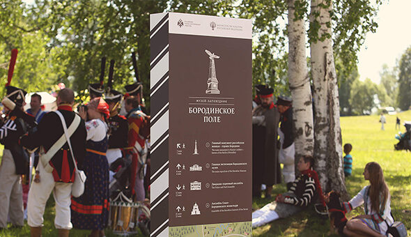
We carried the same idea through the navigation system. The latter is made non-standard. They wanted to make it from a single sheet of rusty metal so that it would be as light and airy as the idea of the monument itself. And so that the cranes also rise from the ground.
For this, it was necessary to make a navigation system from one sheet, so that the images of birds worked in the light, helping to convey a feeling of lightness. In the case of the box, the desired effect could not be achieved, so they worked for a long time on how to make it resistant to wind, and in the end they decided to add a stiffener on the side that does not interfere with the perception of the identity.